DESIGN BOOTCAMP
Taught by School of Motion, this is one of the most intense courses out there and boy, did I get my butt kicked! I got a chance to look over Michael Frederick’s shoulder (the prolific and Emmy-award wining design master), who drops massive knowledge bombs throughout the course. All designs are spec work that mimic real world gigs.
DOTA 2 TOURNAMENT - ORIENTATION WEEK
Kicking off the first week with some styleframes for an Dota2 tournament teaser where the goal was to design 3-4 frames of the title lockup as well as some frames to communicate the transition between footage and the title lockup. I had some extra time on my hands and made two versions.
VERSION 1


version 2


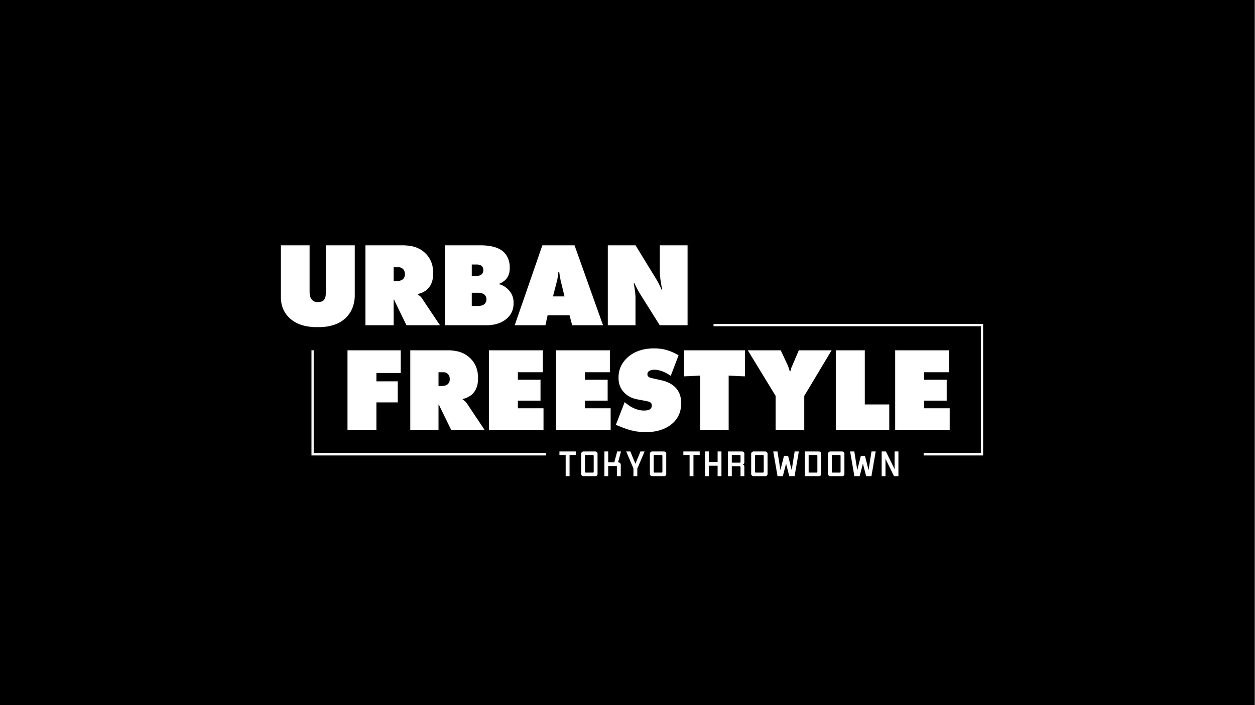
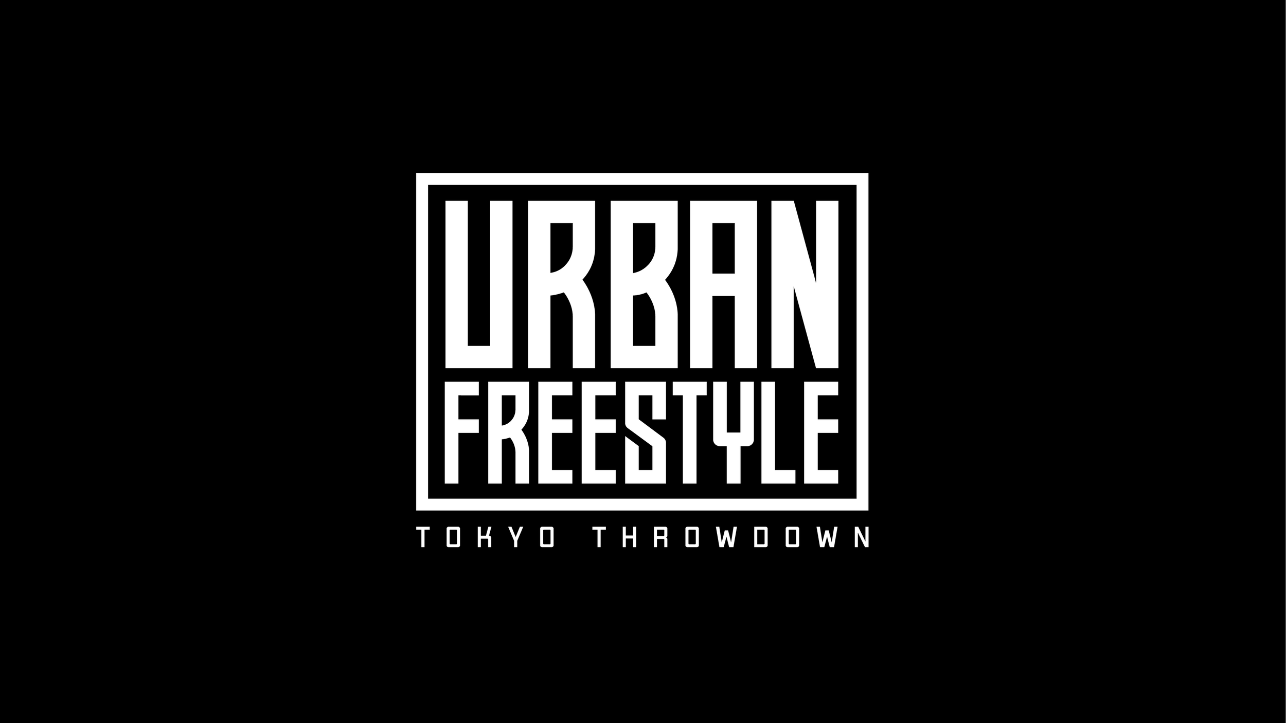
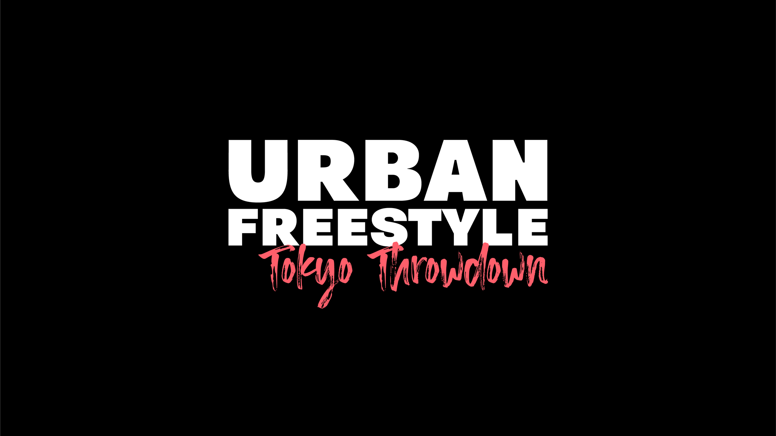
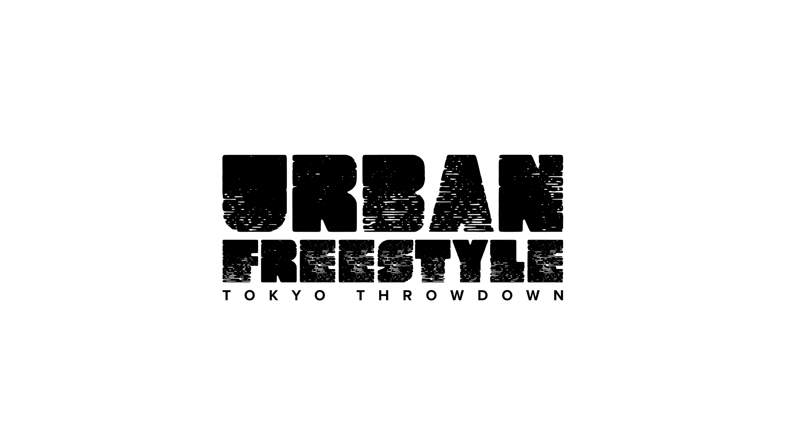
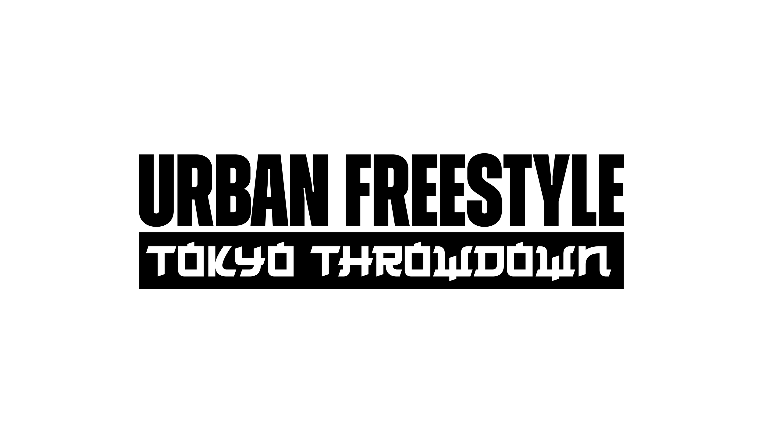
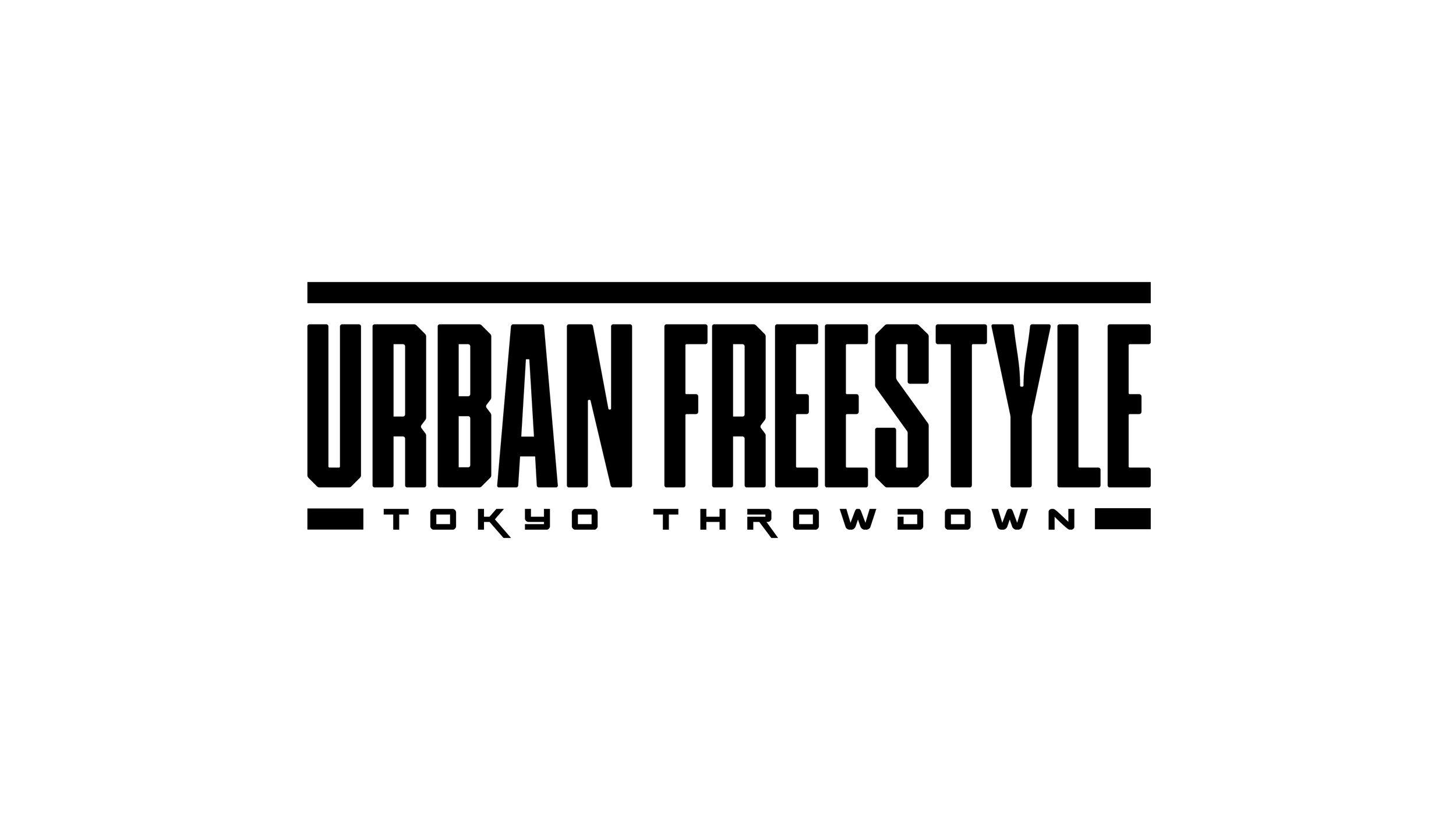
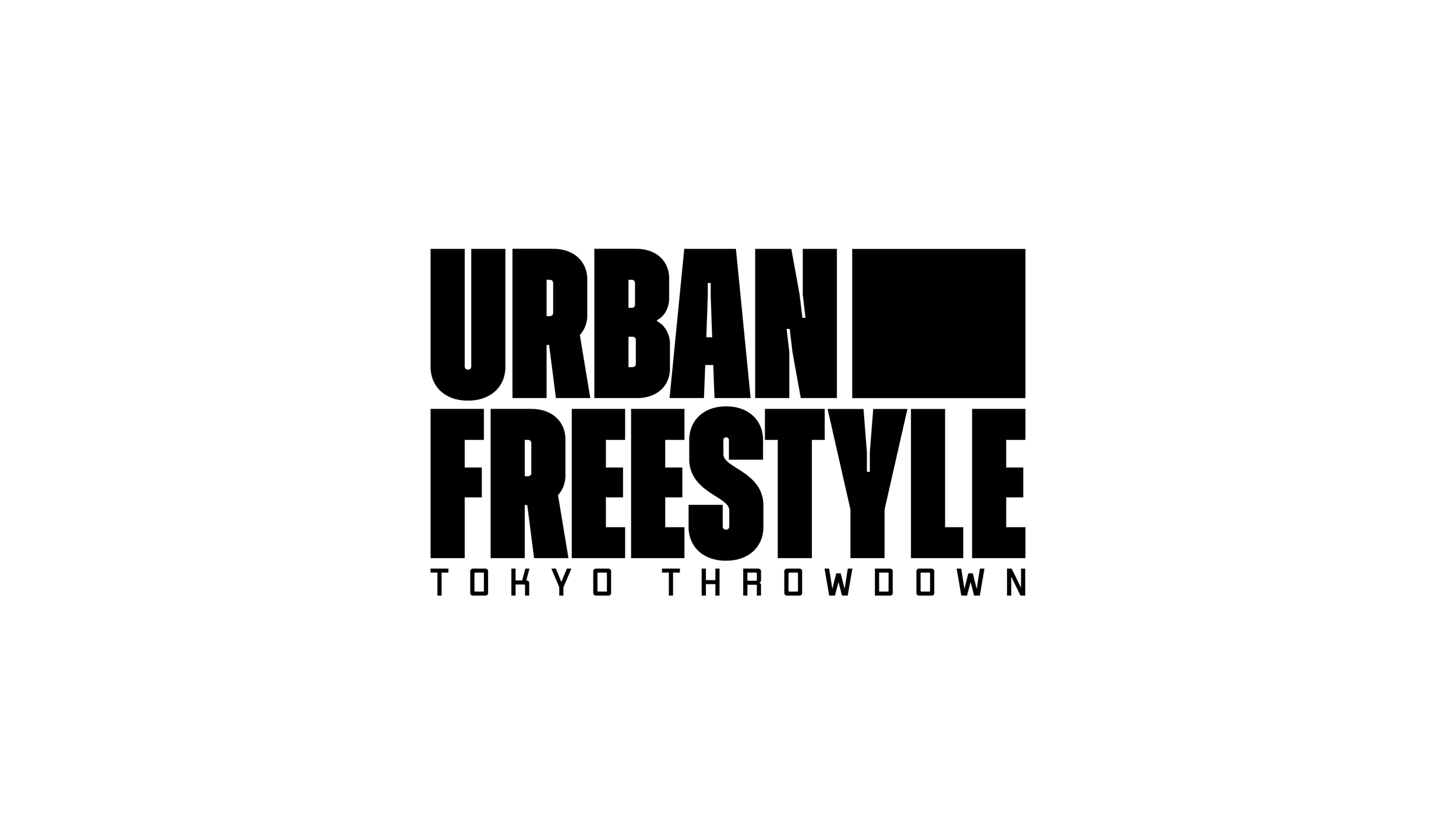
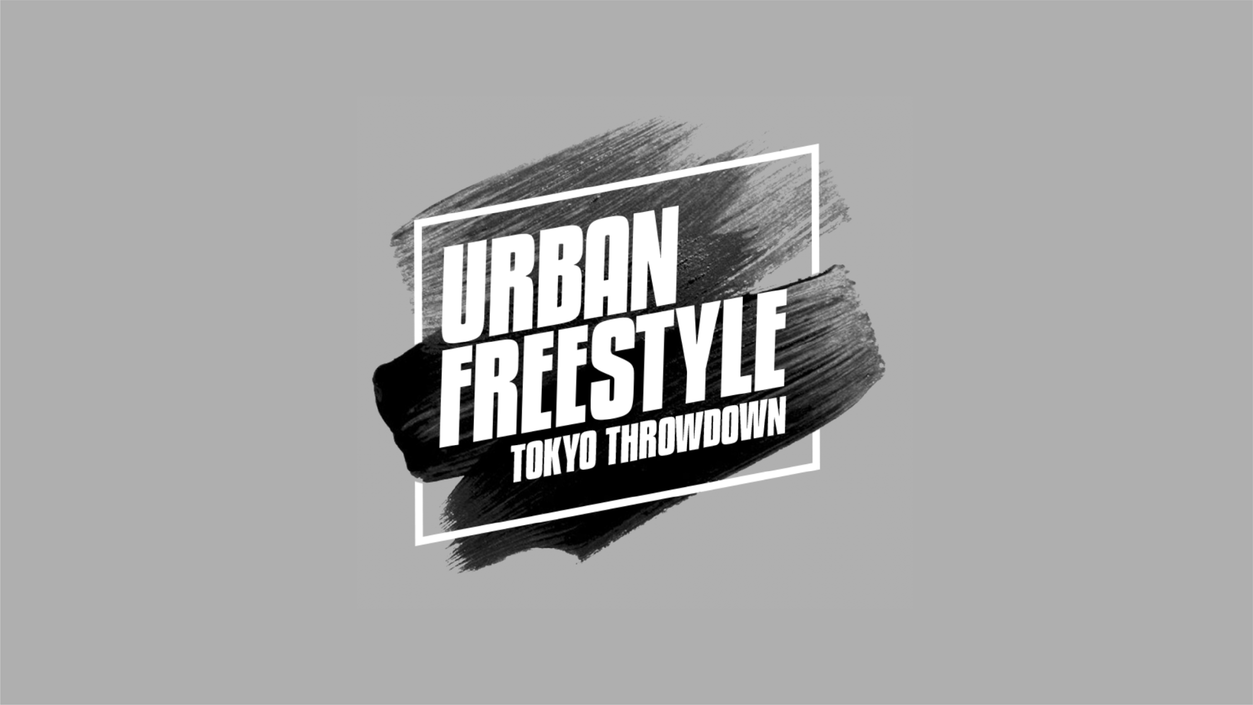
FOX - TOKYO THROWDOWN
Tokyo Throwdown is a fictitious TV show on Fox where teams of breakdancers go up against each other. Our task was to design the frames for the show open. Inspired by Japanese calligraphy, I designed 3D paint strokes in Cinema4D that I used as a device to tie all the frames together.
LOGO EXPLORATION
STYLEFRAMES


NASA - EXPEDITION 100
This was probably my favorite assignment. Nasa is sending astronauts to Mars and making a doc series. We were asked to come up with a treatment of the footage as well as the design for all the graphics. It should feel dangerous, awe-inspiring and dramatic. Since it’s set one Mars, an orange color palette would be the obvious choice but I decided to experiment with some cooler colors to mix things up!


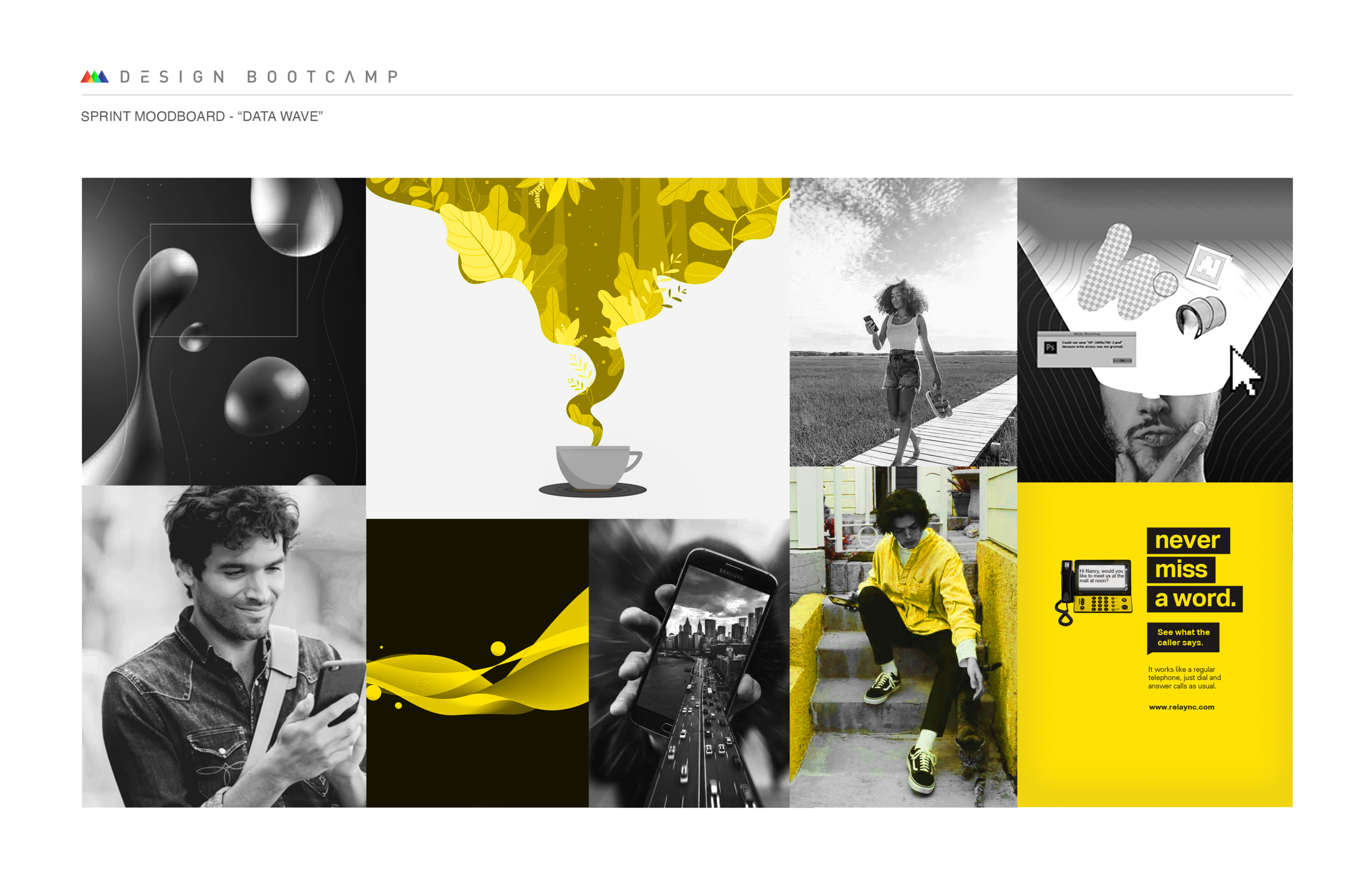
SPRINT - MOODBOARD / OFFER PAGE
This was probably my biggest takeaway from the course: pulling references and making a moodboard is half the design! The task was to make an offer page for sprint that reflects the moodboard that was put together.

Diesel Danceplanet
This one was all about using textures and implying animation. The brief described a commercial spot for an EDM party event so I tried to give the boards a very nightclub-y vibe, which meant tons of neon lights and smoke!


12 KILOMETERS
Things are getting spooky with this title sequence for 12 Kilometers, a horror film directed by Mike Pecci. There’s a dark and mysterious matter that lingers underneath the earth surface that is ultimately the demise of these miners. I used C4D to make the stone fragment to give a sense of breaking that portal to the unknown.


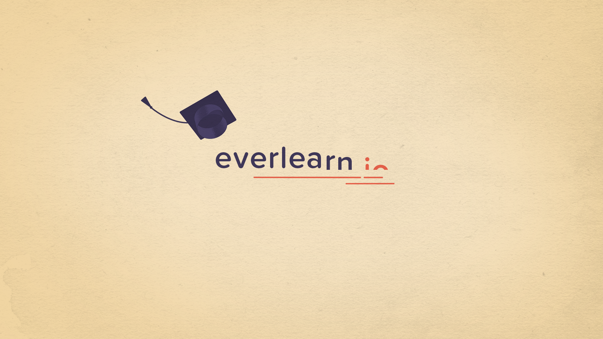
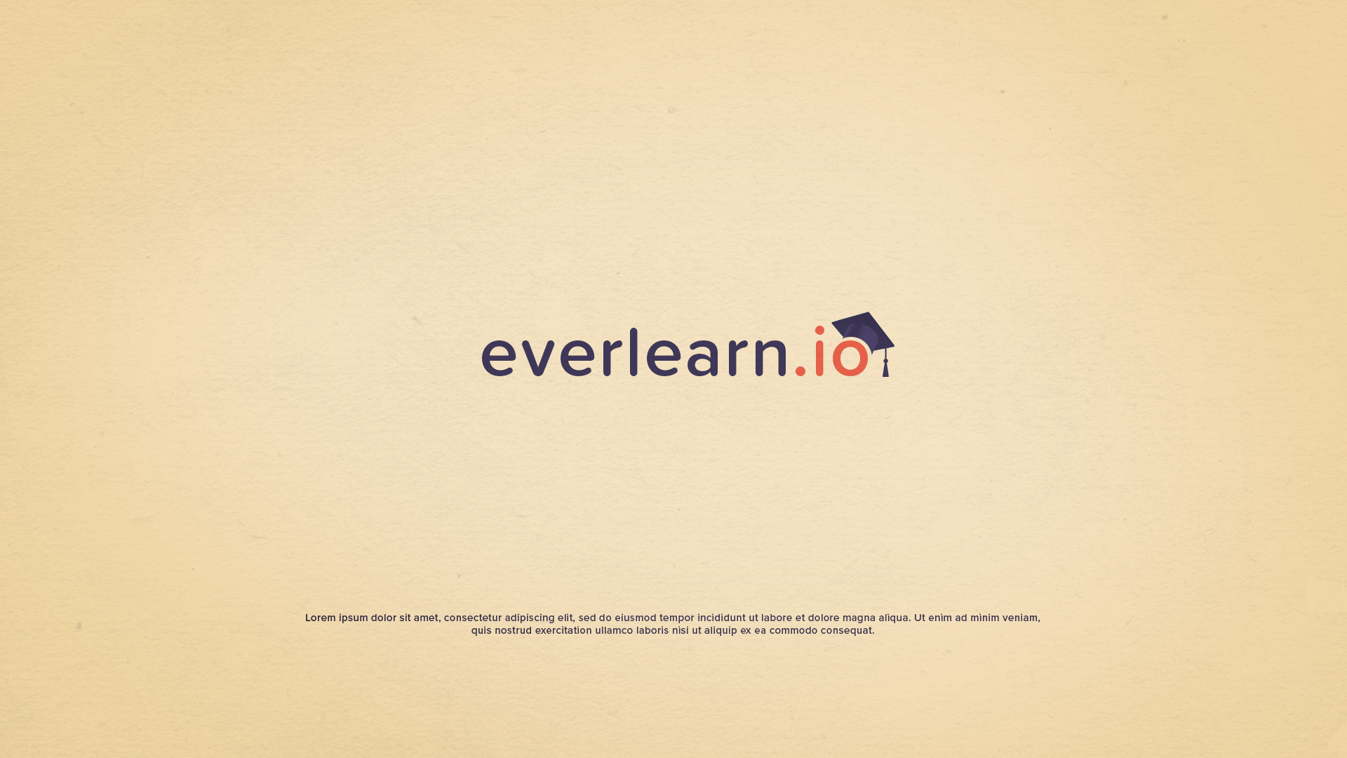
everlearn.io
Two words. Visual language. Sometimes the most simple visuals can communicate a powerful message. Everlearn is a fictitious startup aiming to make education more accessible without the burden of student loans that haunt students for years. We were asked to make a 15 second brand awareness spot using nothing but their (four) brand colors, the logo and our imagination.


converse logo reveal
The third dimension has entered the chat for this five second logo animation storyboard. Since I already had 3D skills under my belt, I decided to take a step further and give Octane renderer a try in order to achieve photorealistic results.


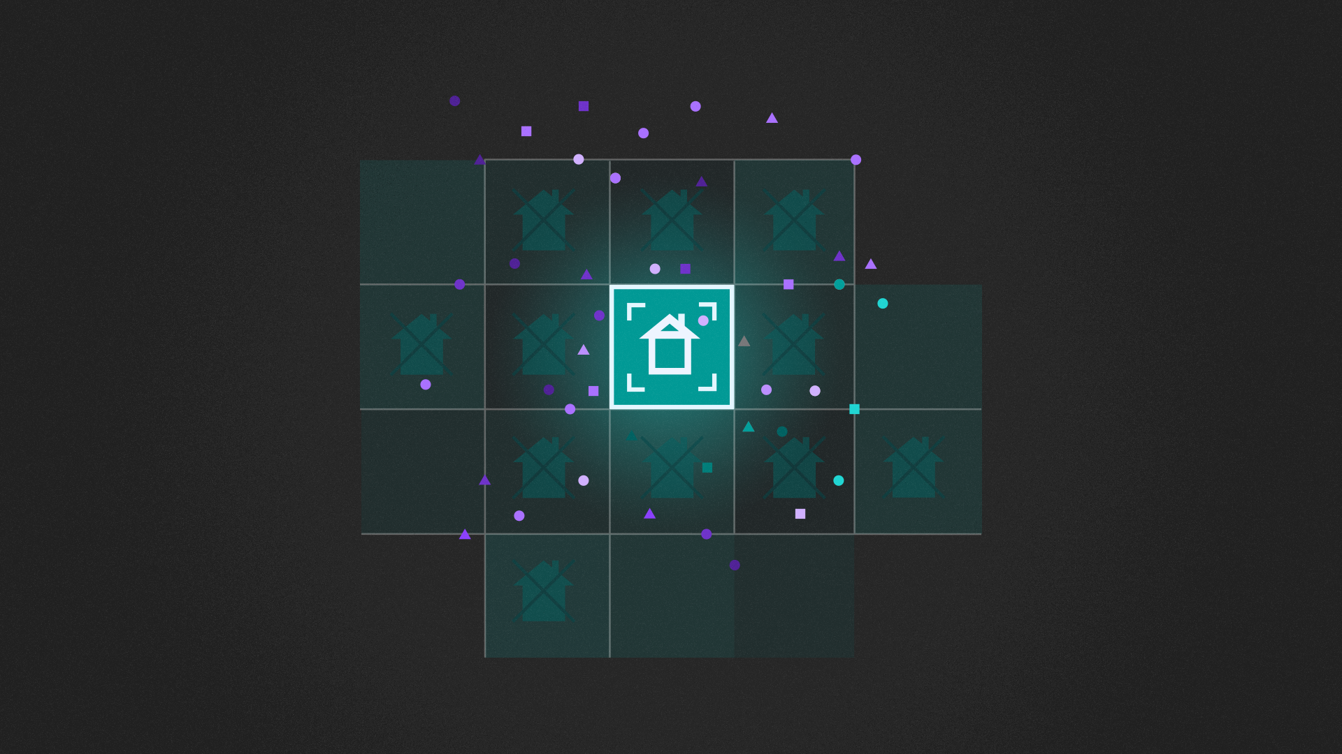
IBM - SMART CITY
As we know, explainer videos are everywhere these days so we were challenged to come up with complete board for a product called “Smart City”. The tone should be inviting and not feel too tech-y or intrusive.
The illustrations were graciously provided by talented illustrator and designer Brian Gosset but even with the help on the illustrations, it was quite the challenge to come up with a color palette and laying out the illustrations to support the narrative.


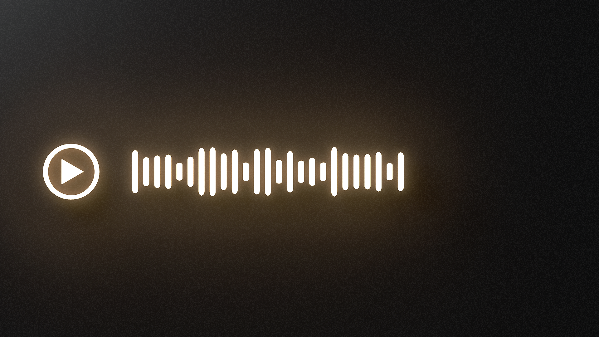
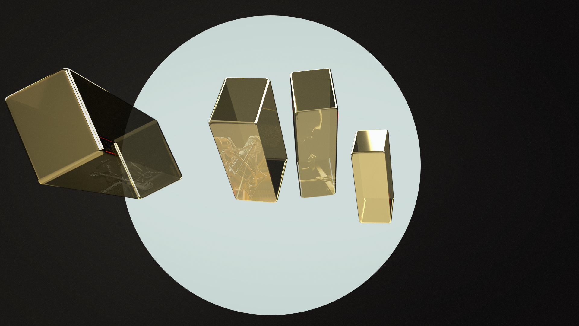
Premiumbeat - The perfect song
The final boss… the ultimate challenge! For the final assignment, the task was to make a full board for a 30 second anthem spot for PremiumBeat. The theme was “the perfect song”. We were given a brand guideline PDF, a color scheme, a VO track and then we were off to the races. I decided to make my entire board in 3D and use the waveform as a recurring visual language that represents that perfect song.
3D models: CGTrader / TurboSquid
Software: C4D, Octane, Photohop, Illustrator
VO, music & SFX: School of Motion